
The Cover Story

In collecting Poems for Katie, it was astonishing to see how much the poems knew before I did. I was sad for so long, deeply but so quietly even I couldn’t hear it. That’s one of the strange gifts of the book for me: the poems, it turned out, were a record of what I was feeling before I could admit I was feeling it.
This is the poem that eventually became the cover image:
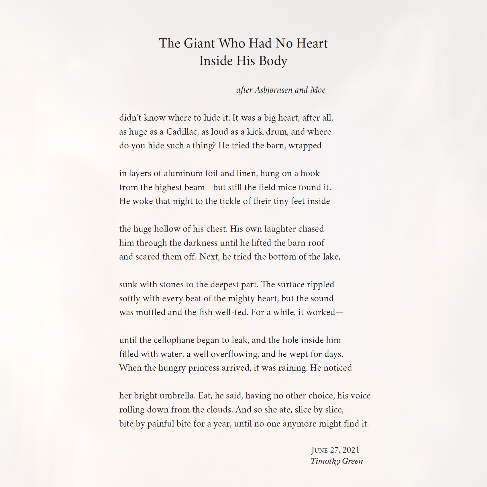
That image—the hidden heart, the displaced heart, the impossible heart wrapped and stored somewhere outside the body—kept following me as I worked on the book. It wasn’t only a striking image. It was the emotional center of the whole project. But it took me a while to realize that, too.
I thought it might be fun to share the actual cover journey that led me there. Katie likes to say that I’m great at making covers, and this is more or less the process I always use.
The first thing I do is read through the manuscript and write down images that stand out, along with whatever ideas first come to mind. For this book, the list included a parachute, a door latch, a bundle of papers, various grasses, a blue balloon, a museum at night, a black bear in the brush, other art that was mentioned in the poems.
There are several ekphrastic poems in the book, with art that happened to in the public domain—so that’s where I began. One of the central poems is “The Cranberry Harvest,” after an Eastman Johnson painting we saw at the Timken Museum in San Diego. I love the way the figure in the painting is looking off at something seemingly spiritual that no one else notices. It seems like a great metaphor for the work of a poet, or of putting a book out into the world generally. This high-res scan would have required permission to use, so I tested it out before going to that effort.
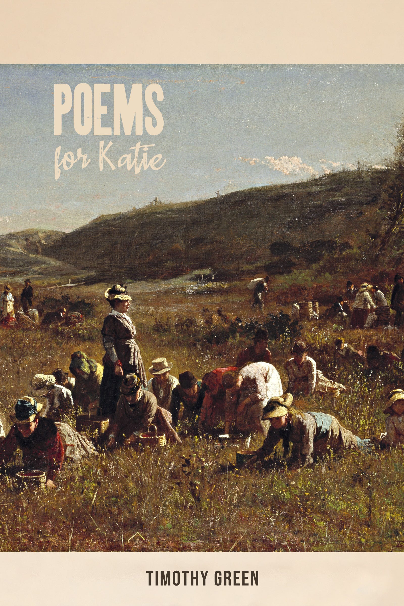
I do love the painting, but as a cover, it didn’t quite work. The tones are too muted, and the image made the book feel more historical and painterly than it is. It was beautiful, but it didn’t have the right emotional temperature.
So then I tried the other ekphrastic piece, a triolet after Manet’s “Luncheon on the Grass.”
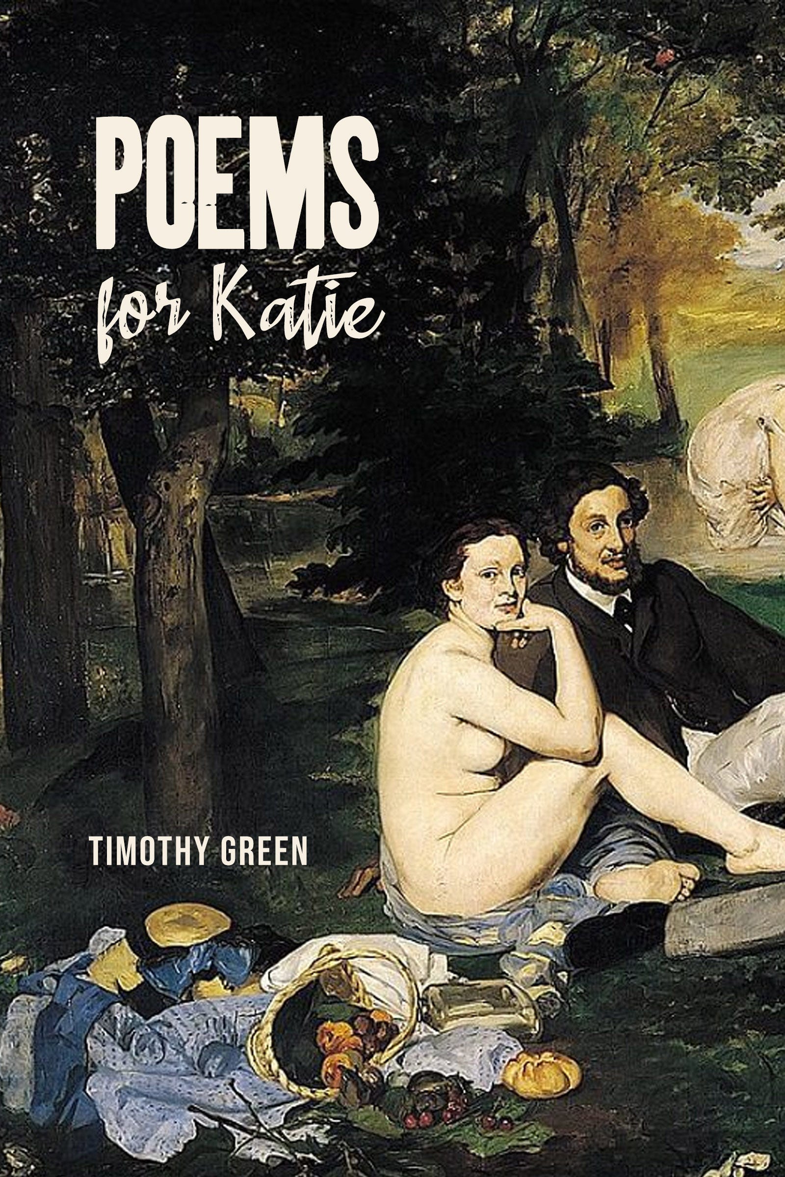
That wasn’t right either. It immediately feels like an art book, and worse, it seems to be making gendered statements about nakedness that aren’t a part of mine. The image was too loud in the wrong direction, and maybe too familiar as a famous painting. It brought with it a whole conversation the poems weren’t having.
So I went back to the list.
The couch kept standing out to me. It plays an important role in the book’s foreword. The poems knew, and the couch knew, before anyone else did. In retrospect, it was almost comic how much of the story had been sitting there in plain sight.
I thought about the abandoned couches we used to find while hiking in the desert, and I had an image in mind that might have worked: a couch out in the wild, domestic life stranded somewhere it didn’t belong. So I searched stock photo galleries and found a few options. I played with adding wildflowers and expanding the scene.
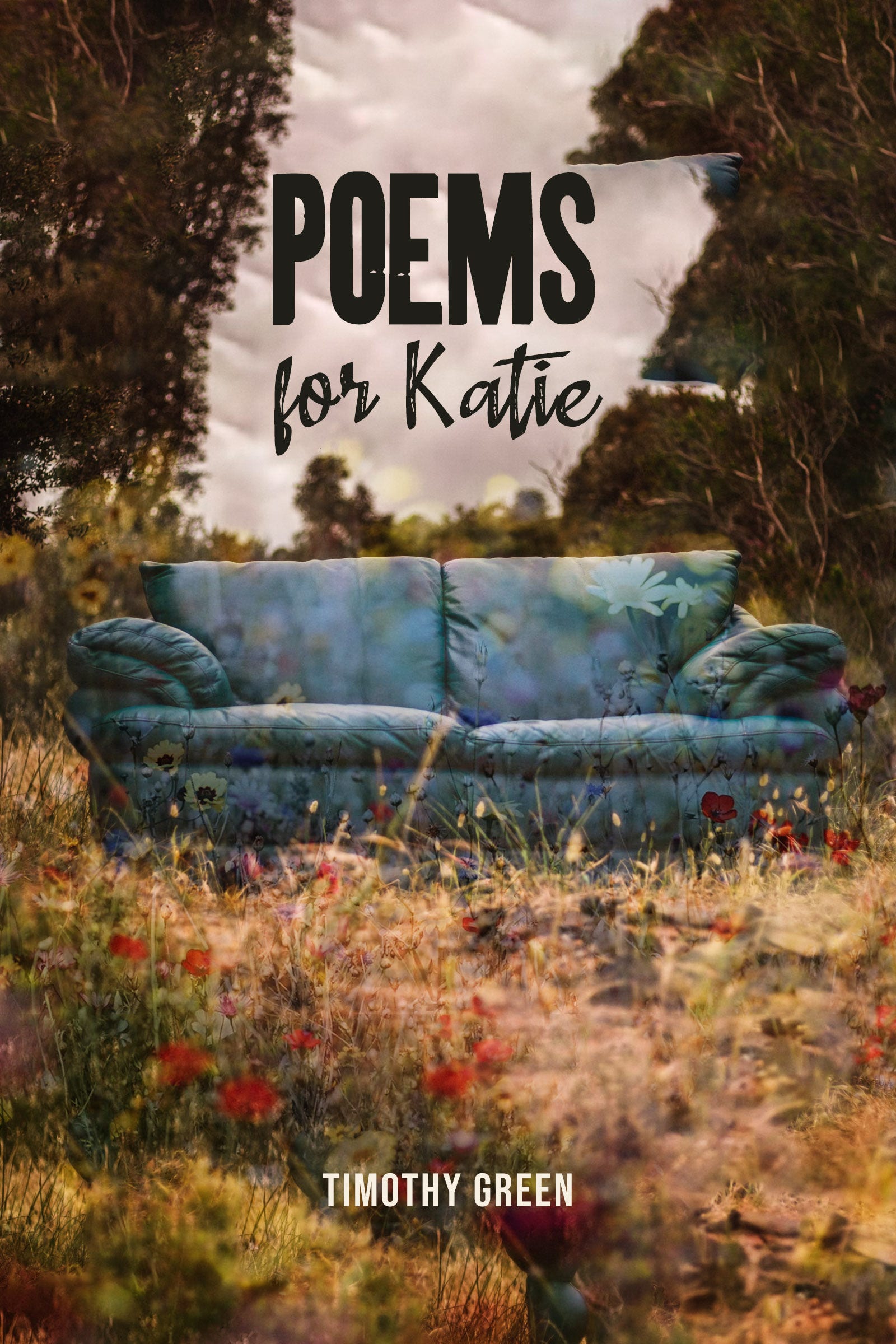
This was the roughest mock-up, because I abandoned it right away, but it helped me realize something important: I wanted the cover to be clean and minimal. The book itself has a lot of movement—prompts, dates, episodes, marriage, divorce, children, a cross-country journey. The cover needed to hold still. And with the book’s sentiment so plainly spoken, the cover need to feel more elegant.
So I went back to the stock photos and found another couch, this time in a simple room. I liked the look of it, especially the symbolism in the bars of light.
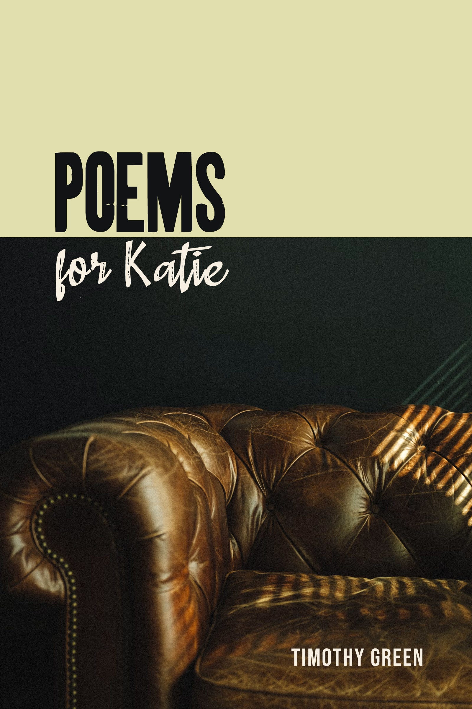
This one got closer. It had solitude, shadow, and the suggestion of being trapped inside a life. But when I showed it to Katie, she said it felt like a psychiatrist’s couch, and she was right. It pushed the book too far toward therapy, or confession, or diagnosis. That wasn’t the feel either.
I thought again about the heart and how that might work if I kept it simple. This led me to a 1950s anatomical heart drawn by H.G. Wetselaar, a Dutch medical illustrator, which had been released into the public domain. It was simple, clean, and striking.

But it still felt too obvious and much too melodramatic: a full, blood-filled heart on the cover of a poetry book where love is one of the themes. That’s so cliché it almost pushes past cliché into irony. But not enough to work.
The giant’s heart in the poem wasn’t simply a heart, though. It was hidden, displaced, protected. It was in a barn, then a lake, wrapped in foil …
So I wrapped the heart in a stock image of aluminum foil with Photoshop, then added a shadow to suggest it might actually be a huge heart resting on the floor of an art gallery. I played briefly with adding an item for scale—people viewing it, maybe, or a ladder. But in the end I decided to stay minimalistic and leave that to ambiguity:
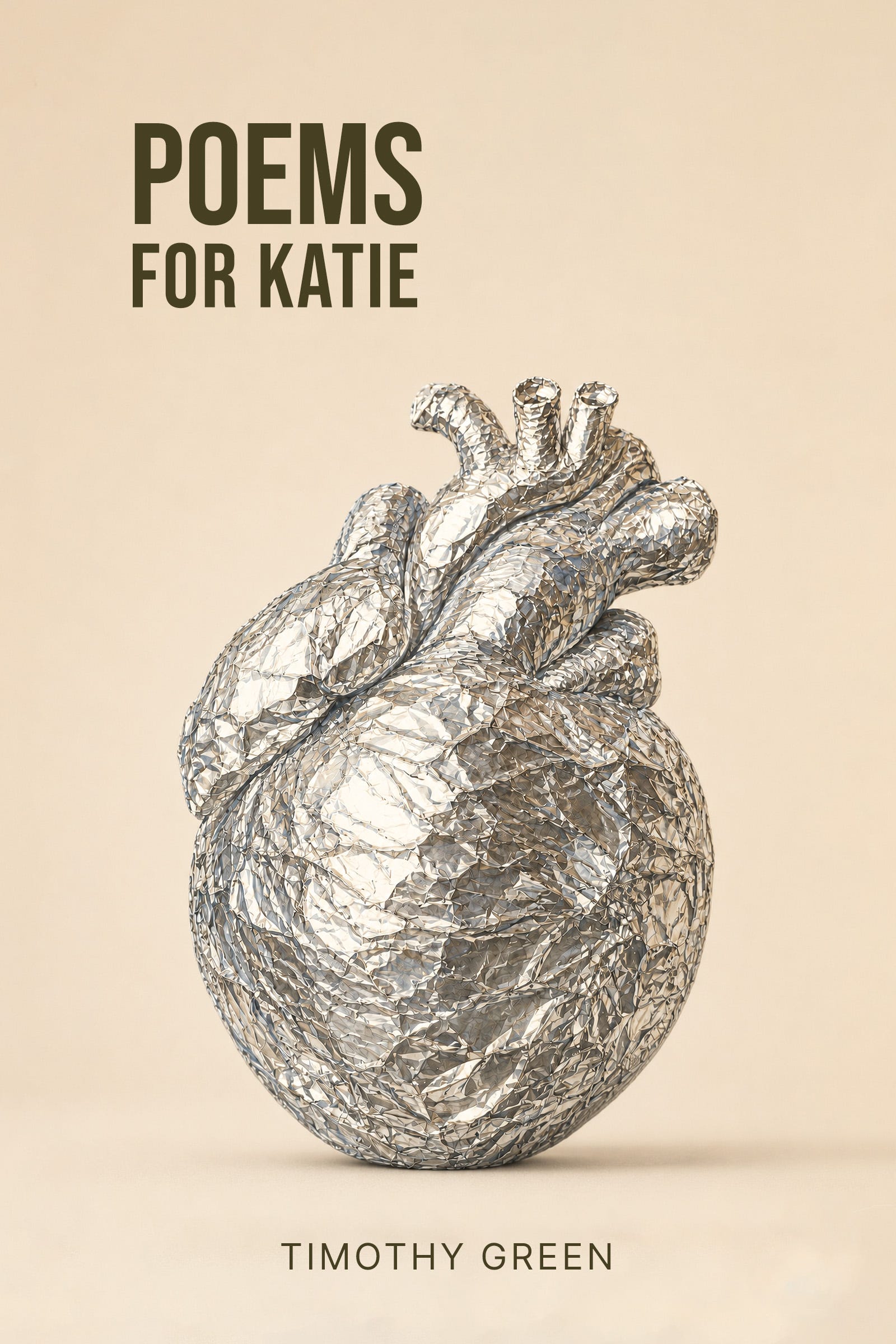
That was the moment the cover finally became the book.
The foil heart is literal, but not too literal. It’s anatomical, but artificial. It’s precious and ridiculous at the same time. It looks protected, but also exposed. It’s a valentine made strange, or a museum object, or evidence from a fairy tale. It suggests love, but also concealment, damage, preservation, and the absurd lengths we go to in order to keep the heart intact.
That feels right to me.
Poems for Katie began as a Christmas present, but it became something else: a record of what the subconscious had been saying all along. The cover had to do the same thing. It had to look simple at first, then keep getting stranger the longer you looked.
And that’s how we ended up with the final cover, which still strikes me as unique, memorable, and perfect for the book.
The final cover is perfect for the collection. And I love hearing the journey to that decision.
Well, it was the stunning Cranberry Harvest that drew me in ... but your process towards finding a bundle of the hidden, displaced, protected, a barn, then a lake, was intriguing.